Level up — How to design better buttons
Expert guide on designing better buttons to improve the UX

Buttons are arguably one of the most important elements in the user interface. If designed poorly, they can have an impact on the user flow which — from a business point of view — can impact conversion rates.
The main purpose of buttons is that they are designed to grab and direct the users attention to an end goal. Buttons can be used in many contexts from saving a document, making a purchase or submitting a form.
Here we’ll look at everything that goes into a button and by the end you should have the knowledge to design better buttons that will level up your UI skill.
Appearance and behaviour
The first principle of any good button is that it should behave and “feel” like a button. The reason why ties in with how, as designers, we want to reduce cognitive load in our UI.
Cognitive load is the effort associated with a certain topic, specifically the amount of pressure we are putting on the working memory.
So what makes a button look like a button, and how do we make sure the user understands that, yes, it is a button?
By using visual signifiers, such as size, shape, colour, shadow, stroke and other styling techniques, you can change a text link to look like a button.
What is a primary button?
Primary buttons are the most important action on a page, that is used most often. This could be buying something, submitting a form or saving a document.
What is a ghost button?
Ghost or outlined buttons are mostly transparent, typically with a thin line border and plain text. The idea is that they provide a clean, minimal look and can be used as a secondary button.
Be careful when using ghost buttons though, as some research and studies have shown that ghost buttons can get lost in the UI and will lead to lower click through rates.
Button states
Button states give context to the user as to the state of the button. A good user interface will clearly show the different states. In web design there are 5 main button states.
The 6 states are normal, hover, active, focus, visited and disabled:
- Normal — how the button looks without the cursor being over the button and the page being linked to hasn’t been visited by the user before
- Hover — when the user’s cursor is hovering over the button, it gives an indication that they can click the button
- Active — when the button has been pressed and something is happening. This could be like a loading animation while saving a document or buying an item and waiting for the transaction to finish
- Focus — when you are pressing on or clicking down a button. It’s usually just a subtle change to the hover and normal state
- Visited — an indication that the user has visited this page before and should only be slightly different to the normal state
- Disabled — if the button can’t be clicked because something is missing on a form or the user doesn’t have permission then the disabled state should clearly show a state which isn’t clickable. This could be greying out the button and changing the cursor state. You could hide the button but I wouldn’t suggest doing this as the user may be looking for the button and wondering why there is no next step. (thanks to Sammy999IsHere on Reddit mentioning this )
Styling your button
The colour of your button

Contrast and visual distinctiveness is the key goal when choosing the colour for a primary call to action button. When designing your button, place it against your site’s other visual elements and check it doesn’t blend in.
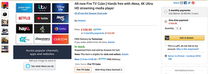
Amazon have mastered this area. In the above reference picture, the “add to basket” is the only main element that uses a bright yellow against the white background and black surrounding text — it’s pretty hard to miss, which is exactly the point.
The shape of your button
Typically the shape of a button is either square or square with rounded corners.
Research has shown support for either one, but if you feel compelled to do another shape then make sure to do usability and A/B testing to make sure people still identify it as a button. This applies to colours and any other styling changes too.
The size of your button
Button size should not be less than 42 pixels and a maximum of 72 pixels. The most preferred button size is 60 pixels at a minimum, with 72 pixels optimal for certain users.
Looking at research studies, a 72 pixel button was preferred by older users and overall produced the highest touch accuracy.
The research investigated the optimal button size, as well as spacing, for touch screen user interfaces, focusing in particular on older adults. I would highly recommend reading the study to see the full findings.
Another research study by MIT Touch Lab found that our finger pads are between 10–14mm and our fingertips are 8–10mm. This means that our minimum touch target size on buttons should be 10x10mm, but keep in mind that once our finger is over the button then it’ll be hidden, so aim for a larger size button.
Content and microcopy
When you make a decision you want to know the consequences of said action. If you had to take action with misleading or generic guidance, it’d be frustrating and you don’t want to potentially alienate your users.
With this in mind, the way in which we label our buttons should clearly state what the consequence would be if it’s clicked. A good button also catches users’ attention quickly, and it provides a taste of what lies next.
Keep the number of words to a minimum. Just a few carefully chosen ones will provide enough clarity to the user as to what to expect next.
Limit yourself to just 1
When designing pages — especially top level pages like a homepage — it can be quite easy to get carried away with placing several primary call to action buttons.
By adding more buttons you are giving more choice to the user. Too much choice can become confusing and put the user off so they end up not clicking anything.
Where possible, a good rule of thumb is to limit yourself to just 1 main call to action button per page.
Where should I place my button?
In short, buttons should be placed where the users can easily and naturally expect to find them. Don’t make it a chore to find your buttons as people only have a limited supply of time and patience for your website or app.
Give your buttons plenty of whitespace and pair that up with standard layouts and conventional placement, which will lead to your button positioning being convenient and comfortable.
Always consider conducting A/B tests, usability tests as well as other user research techniques to ensure users are seeing your buttons.
Summary
A good button is one that is instinctive to your user — they know what it’ll do and where they can find it. The beauty of a button is in its simplicity in function, placement and design. Keep the button text concise and make sure it has enough contrast to other UI elements on the page.
Thanks for reading! If you enjoyed this article and want to see more you can follow me for more articles — Mike
