Level up — Design Better Steppers
How to quickly improve the form filling experience

Progress steps are essential for any form that’s across multiple pages, such as buying an item, getting a quote or applying for something like a credit card or loan.
Steps keep users informed about where they are in the process and how much is left to complete.
The difference between mobile and desktop is that mobile has significantly less horizontal space. By applying the same step design from your desktop experience to the mobile experience you could be causing visibility and readability issues.
With my experience in the comparison industry, which is known for its sprawling multi-page form filling, I’m going to quickly tell you how you can easily improve the mobile experience when it comes to steppers.
Changing from linear to radial steppers
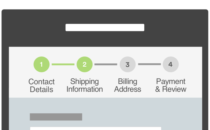
Most of the time linear steppers are used in forms. In fact, when looking into this, the top 4 out of 5 comparison websites in the UK use linear steppers and the other one uses a basic radial stepper.
All of the steppers on these comparison sites didn’t have any contextual meaning, just saying 1, 2, 3, 4…

Cramming in the title of each step, or not having a labels at all, causes readability issues. It’s also confusing to the user as they don’t need to know every single step in the flow. The main things that the user needs to know are:
- Where am I now?
- What is this page about e.g. is it personal details, credit card details, etc.?
- What is next?
- How much is left?
All of this information users need in a glance.
The solution

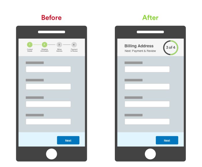
Here is an example of a radial step system. It uses the same space as before, but we are now focusing on things that are the most important, which answers the users questions.
It’s a lot clearer and doesn’t have any readability or visibility issues. The increase in font size makes this overall design a lot stronger and much more accessible to those with poor vision.
We’ve reduced the visual noise of this area too, as we want the customer to focus on the form. The stepper is just meant to be minimal and not distracting from the main purpose — for users to complete the form.
Finally, there’s a lot less for the eye to fixate on compared to the linear stepper, as that required 4 fixations, whereas the radial design only requires 1 or 2.
Closing thoughts
When designing multi-page forms, the key is to have minimal distractions and maximise readability and visibility of the form. Users mainly want to know where they are in the flow and how much is left.
It’s also worth considering that some recent research has emerged that suggests steppers or progress bars had little impact on completion rates. According to Gov.uk:
… our user research showed us that the progress indicator we had designed wasn’t being seen by most users. In fact, those that did notice it were getting confused about what it did, and others were even feeling intimidated when seeing it.
With this in mind we removed the progress bar as an experiment on the live service. We then measured the difference in our completion rates. We found that without a progress bar, completion rates stayed exactly the same while other key metrics, like time to completion and the total amount of online applications, were also unaffected.
If you’re not sure about whether to include steppers, and if you do then how to present it, try to run an A/B test and see what your users prefer — you might be surprised by the results.
Just remember the whole point of your form is to make it as easy as possible for your users to get from start to finish.
